
TheGrint Golf App
TheGrint is a dynamic technology company committed to empowering users to track their games seamlessly across their mobile app, smartwatch app, and website. Additionally, it operates a complementary website dedicated to organizing global golf events called TheGrint Tour.

Project type: UI Redesigns + Feature Development + End-to-end app + branding + UX Writing
Role: I served as the Senior UX/UI Designer and led a tight-knit team of three as the UX Team Manager
Industry: Sports, Social Media
Tools: Figma, Miro, Zoom, Notion, Wrike, Adobe Photoshop & Illustrator, Heap (Data Analytics)
Duration: 12 Months ( Part of the Larger Initiative to Redesign the Entire App )
Overview:
Throughout my four-year tenure at TheGrint, I played an integral role in various aspects of the organization. I took charge of revamping our Android and iOS apps for both mobile and smartwatch platforms, as well as revitalizing both of its websites ( TheGrint and TheGrint Tour ). Notably, our smartwatch application earned the prestigious top pick designation from My Golf Spy, an ESPN-affiliated website. Through meticulous analysis of user data, we identified distinct user behaviors across the app, smartwatch, and website, leading to comprehensive redesigns aimed at enhancing their synergy.
This strategic approach resulted in a remarkable 96.30%% increase in subscriptions within between 2019 - 2021, underscoring the success of our efforts. Our marketing strategy, rooted in grassroots initiatives, garnered overwhelmingly positive feedback from users, who enthusiastically shared their experiences with friends.
While I could share countless stories about my journey at TheGrint, I'll provide you with the highlights of the score tracker feature which went through a few iterations and launched in 2020. Should you wish to delve deeper into any aspect, or any other feature displayed in the carousel below, feel free to let me know—I'm more than happy to share!


Team Organization: Our Approach!
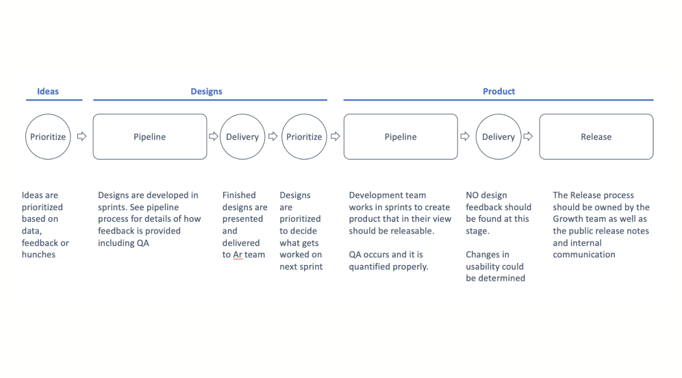
Beginning The Flow
We collected feedback and prioritized projects based on urgency and impact in the first week, delivering designed solutions by the second to the development team.

Our Two Week Sprints
The design team worked closely with the development leaders in ideation, coordinating tasks and priorities to ensure alignment between design and development.

Quality Assurance
Our process emphasized teamwork by implementing a two-tier quality control measure to ensure top-notch results before releasing any features.
An Important Advantage:
As TheGrint managed golf tours with weekly participation ranging from 30 to 100 people, our research team and tour managers provided immediate feedback on our products. This direct input allowed the UX team to tailor our offerings to the needs of our power users, incorporating their suggestions for improvements and new features. Consistent requests were noted and reviewed at the start of each sprint to prioritize projects effectively. Testing beta features with power users provided invaluable insights, uncovering any overlooked design flaws. This advantage positioned our team ahead of competitors in addressing user needs directly.
Score Tracker: Keeping Track of Every Game
Background: Why The Score Tracker Matters?
The ScoreTracker is the backbone of TheGrint, serving as its most utilized feature and driving user engagement. It revolutionizes the way players keep score, eliminating the need for traditional pen-and-paper methods. With this feature, users effortlessly record their scores on their mobile devices during play, with all data seamlessly stored in their profiles and instantly uploaded to the official USGA website. This eliminates the tedious process of manually transcribing scores from paper to digital. Moreover, the ScoreTracker offers satellite imagery for each course, aiding players in strategizing their approach for every hole, along with a comprehensive history of their past performances on each course, hole by hole.

The Problems
UI Upgrade Essentials: The UI required updating to accommodate upcoming features like note-taking, advanced stats recording, and a convenient option to disable the GPS monitor for battery conservation. Battery drainage was a significant concern among users who struggled to keep their mobile devices powered throughout the entire round.
Map View Limitations: The Map view lacked the functionality for players to input scores or switch between players, causing inconvenience for scorekeepers who needed to input their friends' scores. This unnecessary switching between screens disrupted the scoring process and led to a decline in usage of the Map view during rounds.
Overlooked Performance Stats: The hole statistics, showcasing a player's past performance, were a feature that many users missed, either due to difficulty in locating it or simply being unaware of its existence. Through feedback, we discovered that users struggled to access this feature as it required tapping their profile picture, a hidden function they weren't aware of.

Goal
Score Tracker Upgrade: Elevate the score trackers’ UI to excel in simplicity, scalability, and convenience.
Remove Map View limitations: Streamline the map view to enable effortless scorekeeping and player switching.
Offer More Value: Amplify user engagement by increasing the prominence of detailed round statistics and broadening data recording capabilities with a new score tracker.
Why we felt confident about our goals?
With support from our dedicated success team, who diligently documented feedback, alongside insights from our research team and TheGrint Tour manager, we identified key recurring pain points. While some stemmed from user feedback, others were valuable suggestions from our power users. With this recorded data, we understood that addressing the needs of our user base would ultimately yield positive results.
Competitive Research: Weakness, Opportunity & Strength
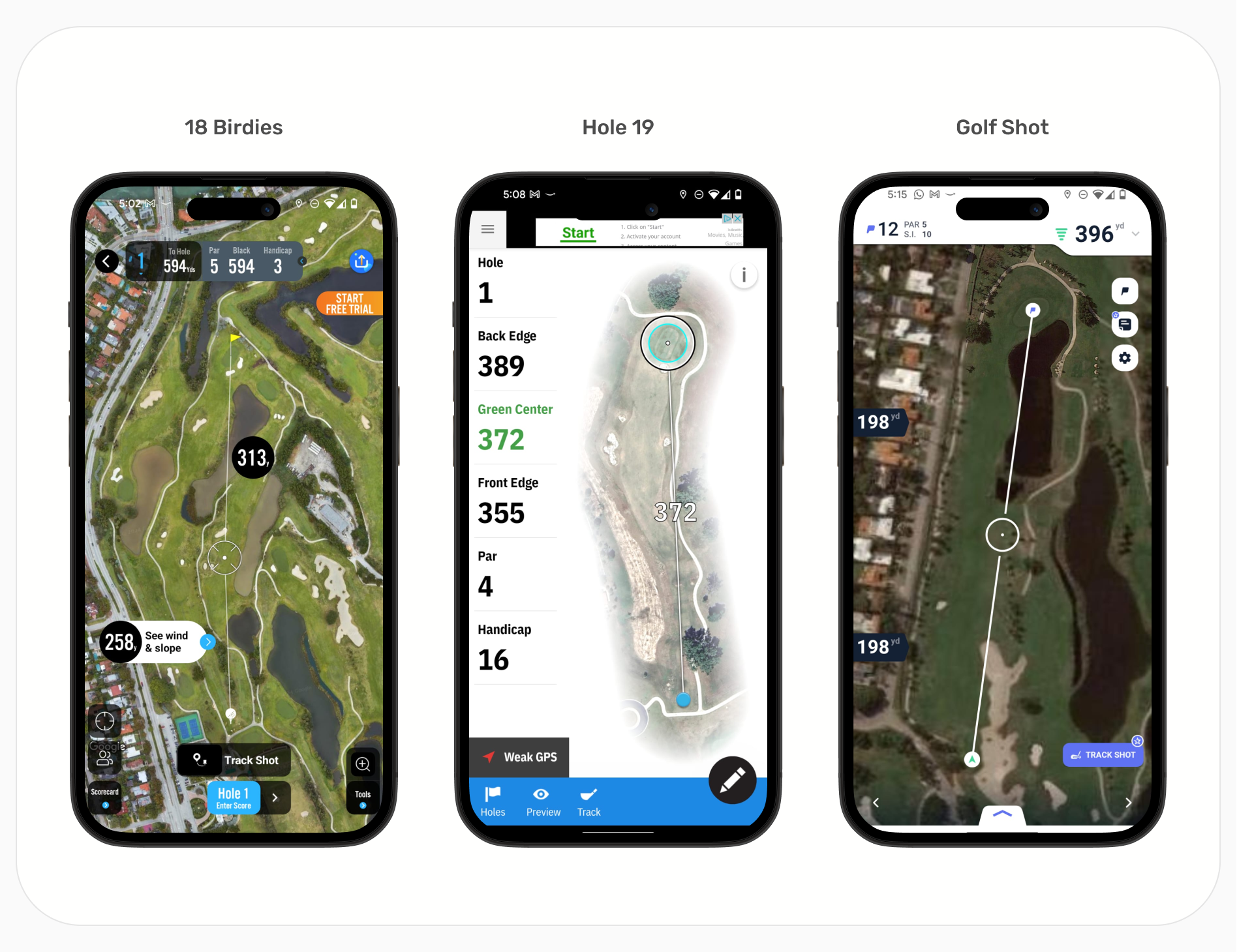

Key Insights
Weakness: TheGrint lacked a feature allowing scorekeeping in map view, setting it apart from other score tracking apps.
Opportunity: Addressing two highly requested features, green maps and player's notes, presented a unique opportunity as no other competitor offered them. Additionally, TheGrint was the only other app allowing scorekeeping for friends.
Strength: TheGrint provided users with the ability to save more data than any other competitor. Moreover, TheGrint's satellite images, rendered in 3D for real courses, offered superior quality compared to competitors.
Designing The New Score Tracker

Bot Navigation Analysis
Using Heap Analytics, data revealed that the camera feature was significantly underutilized compared to the GPS toggle, which was accessible only through a separate menu on the screen.

Tracker Evaluation
We proceeded directly to mid-fidelity designs, confident that we could overhaul the structure of the score tracker, given our users' familiarity with it.

Decluttering the Screen
Consolidating the player selection screen, score tracker, and stats into one interface created a design that was difficult to comprehend and navigate.
Mid-Fidelity Score Tracker Ideation

First Idea: Players share space on top of the tracker
In this concept, players and scorekeeping are combined within a single score tracker interface. The player area adjacent to the score dynamically adjusts based on the number of participants in the round.
Issue: Displaying player information within compact squares may pose readability challenges, especially on smaller screens. Additionally, concealing stats within this layout could exacerbate usability concerns.
Insight: This design may prove beneficial for team-based play scenarios.
Second Idea: Player Placement at Bottom of Tracker
In this concept, players are relocated to the bottom of the score tracker. When selected, they expand to display all relevant information about their round. This arrangement allows for ample horizontal space, reducing the congestion of player cards.
Issue: On smaller screens, locating players may be challenging if scrolling is required. Minimizing the need for scrolling is a priority. Additionally, automatic player switching upon score entry could cause visual confusion.
Insight: Positioning players in a consistently visible section allows for smooth transitions between golfers without sacrificing any information displayed in the score tracker and reducing visual confusion.
Key Takeaways
In our evaluation, we identified potential readability challenges with displaying player information in compact squares, particularly on smaller screens. Additionally, concealing stats within this layout may compound usability issues.
To address these concerns, we proposed positioning players in a consistently visible section of the interface. This approach facilitates seamless transitions between golfers while preserving all information displayed in the score tracker, thereby minimizing visual confusion. As a potential solution, we considered redesigning the bottom navigation, which was already slated for an overhaul.
Resolving Challenges: Rethinking Bottom Navigation

Choosing between idea 2 and 3
We were split between Idea 2 and Idea 3. To settle the matter, we decided to put both ideas to the test with a select group of power users using a quick prototype. Ultimately, only the new bottom navigation made it into the beta prototype.
Issue: Idea 3 posed a challenge. While it improved player selection during rounds, it hid the GPS toggle and scorecard—two essential features. Moreover, it required users to take extra steps to access them. Ultimately, Idea 2, resembling our previous setup, proved most effective. Consequently, we're exploring alternative methods for player selection.
Insight: There was a silver lining, idea 3 performed exceptionally well on the map view screen. It streamlined player selection and scoring during rounds. As a result, we kept the bottom navigation there and went with Idea 2 for the score tracking screen.
Key Takeaways
While reinventing the wheel doesn't always yield success, as attempted by consolidating all players in the bottom navigation, exploring unconventional ideas often leads to valuable insights when tested. Although Idea 3 didn't resolve the issues on the score tracker screen, it effectively addressed concerns on the map view screen.
Hi-Fi Design & Final Testing

Upgrading Components
After gathering insights from previous testing, we felt confident to advance with hi-fi designs, updating the UI, and subjecting them to one final round of testing.
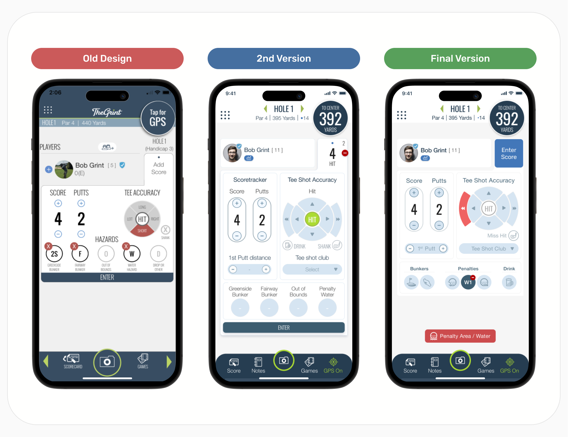
Second Score Tracker Test
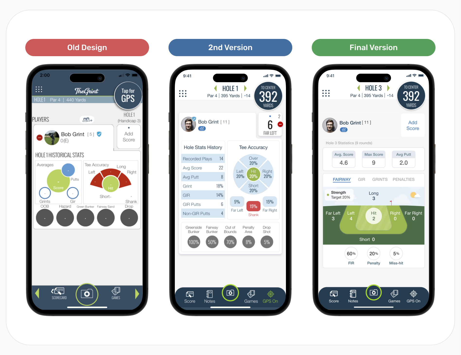
During testing of our hi-fi prototype (2nd version), we identified a couple of issues requiring attention.
Firstly, the enter button was concealed on smaller screens as it was placed at the very bottom. This placement was retained from the old design, which was shorter and did not encounter this issue.
Additionally, feedback indicated that the Score Tracker was overly large and cluttered due to the incorporation of numerous new functionalities per user requests.
To address these issues:
We relocated the enter button to the area where users would typically tap "add score" in the old design, as the score was already displayed in the controls during score input.
We eliminated unnecessary titles and implemented snack bars to inform users of their selections. For instance, in the final version, a snack bar appears at the bottom to notify the user of a selected penalty, a feature also applicable when using tee shot accuracy.
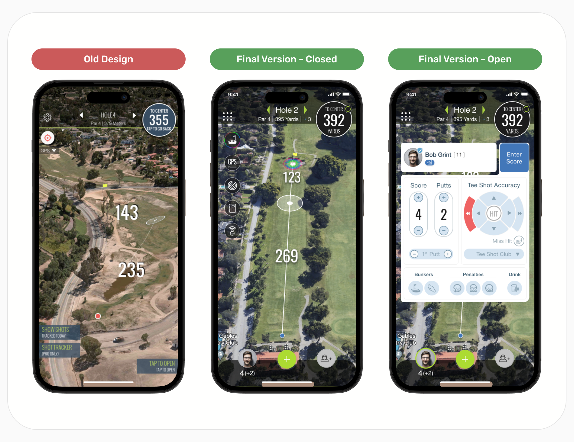
Second Map View Test
Users provided positive feedback on the newfound capability to add players, switch between them, and input scores directly from the map view. While no changes were implemented due to the generally positive feedback, personally, I am dissatisfied with the appearance of the score tracker.
Some design changes not previously mentioned
With the addition of player selection in the bottom navigation, we relocated all features previously situated at the bottom to the top left. These features are now represented by floating circular buttons, as observed in the final version.
We revamped the top navigation to mirror the design of the score tracker screen's top navigation, with the exception of color variations. This adjustment ensures a smoother transition between screens.
Second Performance Stat Test
The issue we encountered with the second version of the performance stats was its failure to resolve a key problem. The stats remained hidden behind the player profile, necessitating users to tap on a player's profile to access them.
Furthermore, the new performance stats lacked engagement and were perceived as a mundane list of information. Feedback from users indicated a neutral response, which was concerning as it showed indifference towards the feature.
To address these issues:
The majority of rounds recorded on TheGrint are logged by users inputting their scores individually, without friends. This presented an opportunity for us to utilize the vacant space on the score tracker screen to display their performance stats by default, closing them only when the player enters their score.
We introduced visual graphs depicting the fairway, the green, and other relevant information to enhance user engagement. Overall, users responded positively to this new design. To prevent confusion among new users, these visual graphs are displayed only after they have logged in three scores.
High Fidelity Prototype
Assessing the Fruits of Our Labor: A Conclusion

Insights from the Data
We were delighted to observe that the largest growth we experienced was in paid users, with subscriptions increasing by almost 100% between 2019 and 2021. Additionally, our retention rate for paid subscribers remained robust at 80%.
